
Standing Out with Simplicity
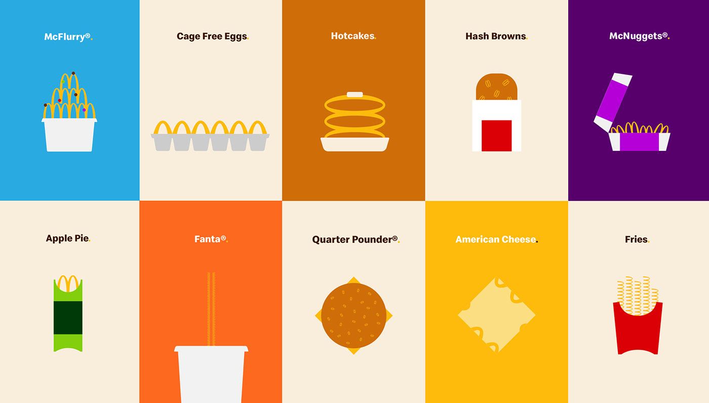
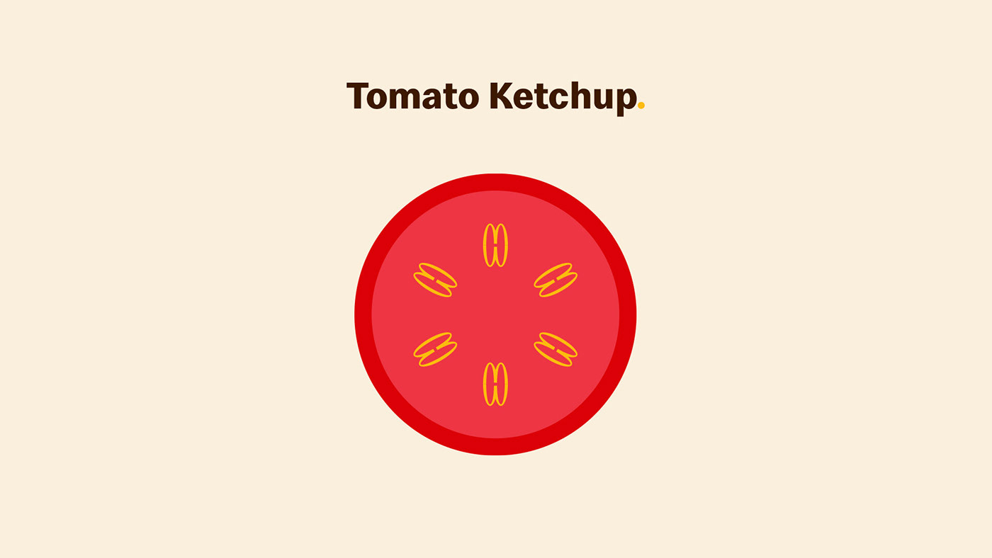
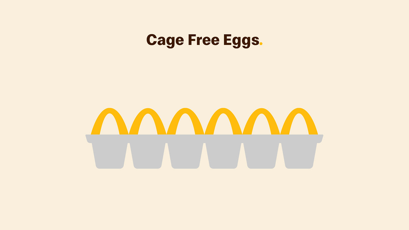
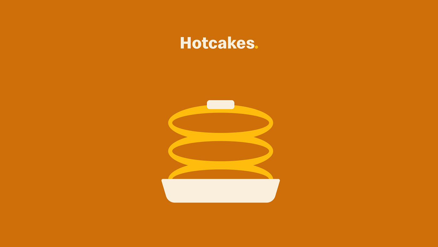
Facing a sea of similar food imagery, McDonald’s leveraged its most recognizable asset – the Golden Arches – to create a unique visual language. This playful system, applied to packaging, advertising, and even in-store displays, transformed the arches into icons and patterns representing their menu items.


Golden Arches Take Shape
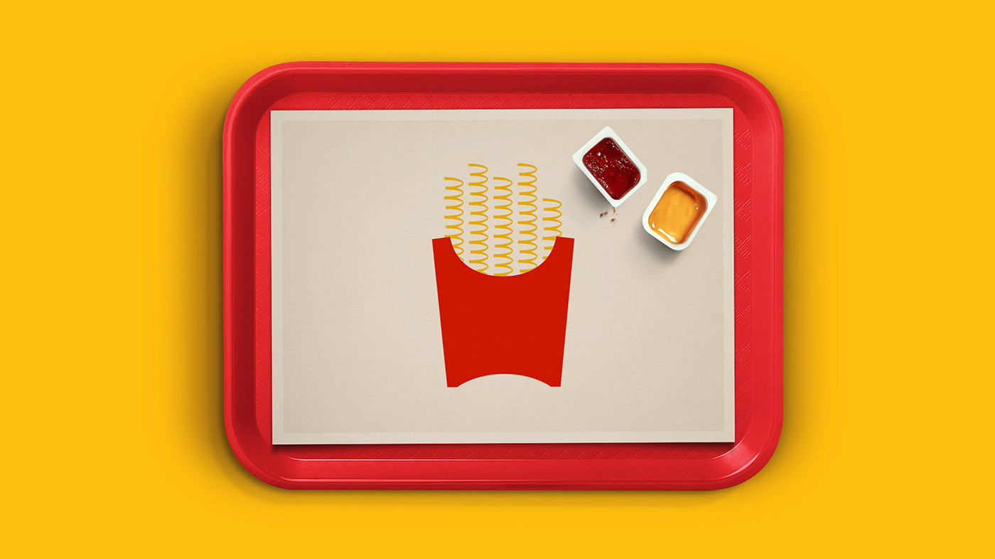
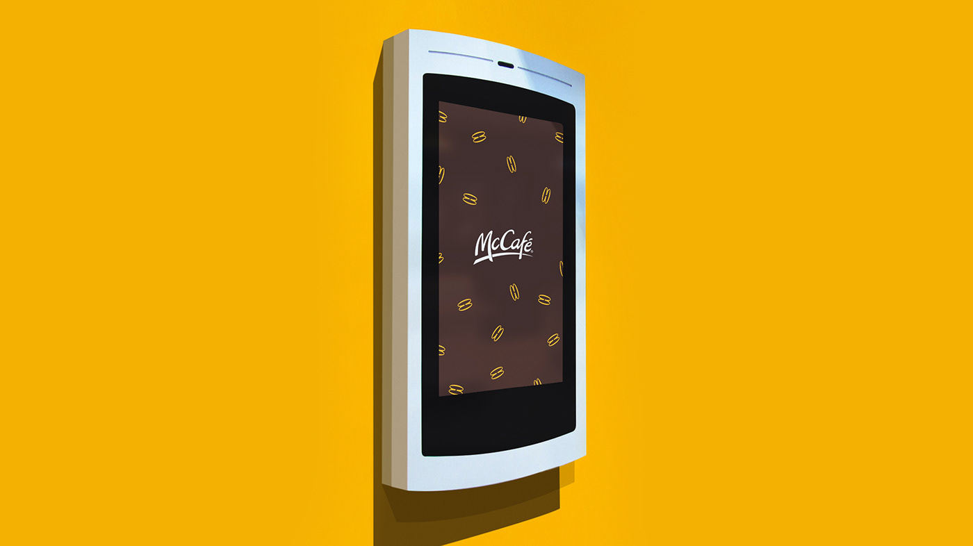
Across billboards, digital displays, print ads, social media (including shoppable Instagram Stories), TV commercials, cinemas, and even restaurants, the arches came alive. They morphed into the fluffy mound on a McFlurry, mimicked stacked fries when presented sideways, and twisted to resemble a stack of hotcakes. Notably, the McDonald’s name itself took a backseat.


The Arches Whisper “Mmmmmm”
This clever approach didn’t just showcase food; it subtly communicated the brand’s iconic tagline, “Mmmmmm,” through the sheer repetition of the arches.


