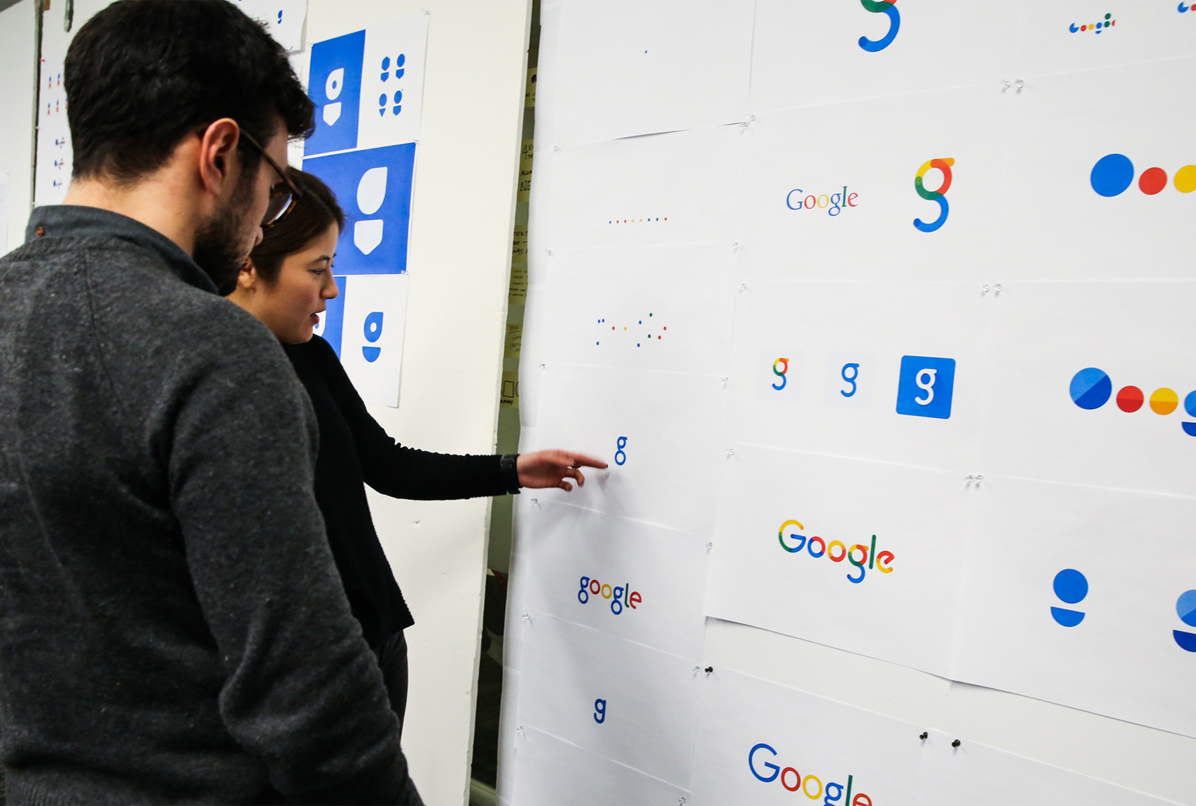
During my time at Google, I had the privilege of serving as a lead motion designer tasked with evolving and implementing their brand identity & language across all core products. This is a brief montage of a few of the pieces I worked on. – Adam Grabowski

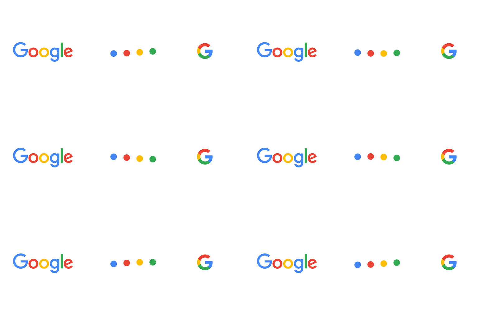
Left to right: The Google Logotype uses a sans serif that retains our distinct multi-color sequence. The Dots are a dynamic distillation of the logotype for interactive, assistive, and transitional moments. The Google G is a compact version of the Google logo that works in small contexts.


